PPC Landing Page Best Practices
For Increased Conversion Rates
Picture your current PPC or Paid Social landing page with a conversion rate twice as high, going from the industry average of 2.35% to an impressive 4.7% performance. That's double the number of leads going to your business. Alternatively, you could get the same number of leads with half the ad cost.
In this blog post, we'll discuss some of the most effective PPC landing page best practices we've seen after working on hundreds of landing pages and spending millions of dollars in advertising. These strategies cover the critical few things we've found that can make a big improvement on almost any PPC landing page.
Have a Clear Call-to-Action
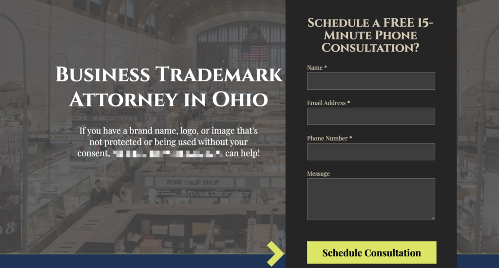
If you only do one thing right with your landing page, make it abundantly clear what you want the visitor to do. Call, email, chat, buy, etc. One way to accomplish this is by having a form or phone number right at the top of the page. Don't force your visitors to have to scroll in order to find a contact form - have the form or phone number higher up on the page so it's clear how they can get in touch with you.
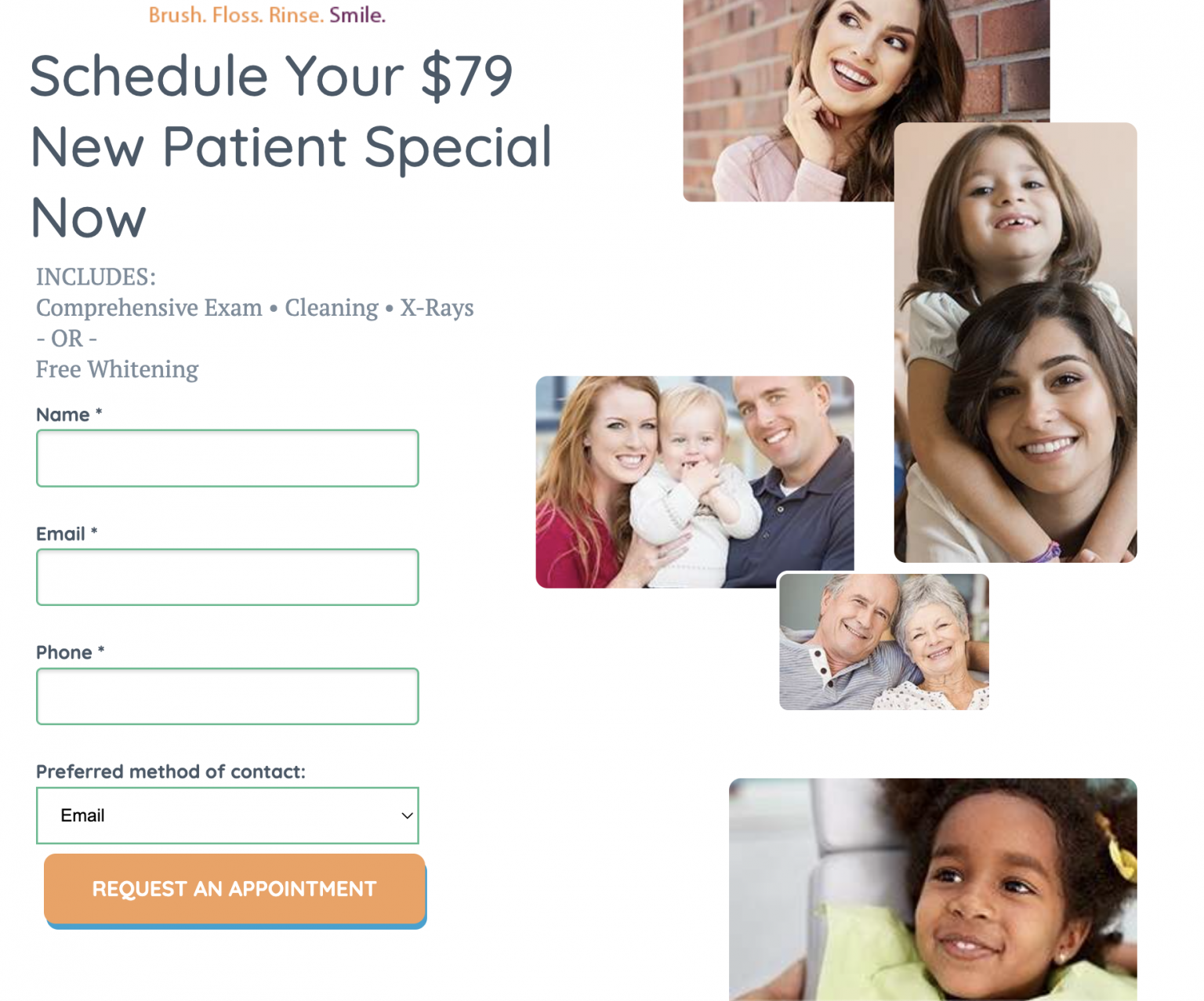
Also consider making the button and phone number a completely different color to help it stand out. Again, make it as easy as possible for a new visitor to contact you and find your main call to action. You'd be surprised how many client landing pages will have the phone number at the bottom of the page or not mobile "click to call" friendly. You're working hard to get people to your site, make it VERY easy for them to contact you!
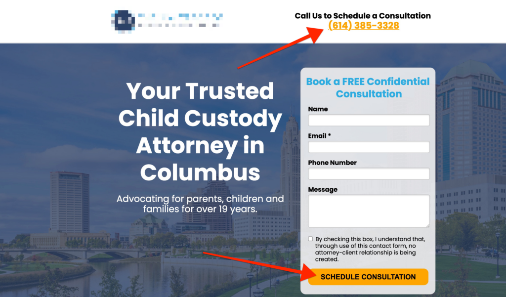
Don't concern yourself with using something different from your "brand colors". That's the whole point. If your brand is blue, having your button colors as orange, red or green will stand out and get someone's attention.
Don't obsess over what color it needs to be, as we've found there's no one universal recommendation. As long as it sticks out from the rest of the colors, you're good!
Clean, Not Cluttered
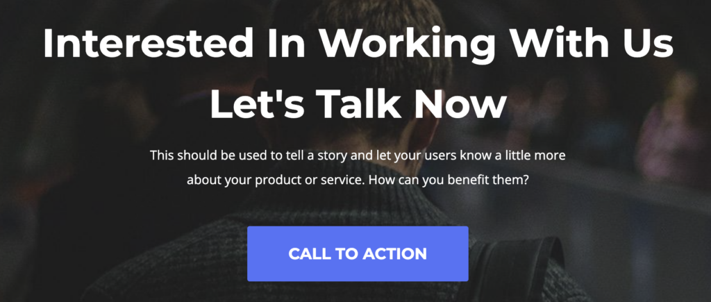
One of the main reasons PPC landing pages work so much better than the main website or service pages for clients, is that landing pages have a more stripped down and simple design that focuses the user on the main goal you want them to accomplish when they visit the site.
Too often, homepages and other pages of a website have too many distractions: news stories, blog posts, menu links to less important pages, and many other distractions that take the user away from your main goal - for them to contact you or buy something.
Think of a well-designed landing pages as a "one-pager" of your business that helps sell your products or services in a concise and clean design. They shouldn't have to go anywhere else except that single page to learn enough about your business, and why they should work with you.
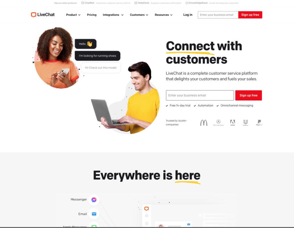
Take a look at LiveChat's.com homepage. Clean, uncluttered, lots of white space, easy to read headlines and text, call to action buttons that stand out, and more. This page just makes me want to sign up for their service. Is your landing page this clean and uncluttered?
Chat Boxes
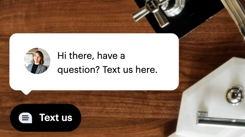
Speaking of chat, having a chat box is a great way to increase conversions. Visitors each have their own preferred way of communicating. Some people prefer calling. Some prefer emailing. And some like to use a chat box to get their quick 1-2 questions answered. In fact, 73% of customers find live chat the most satisfactory form of communication with a company.
Use Chat Automation
You may be thinking... "but we don't have internal resources to chat with visitors all day." No problem! Chat software is very sophisticated these days. You can automate and answer a lot of frequently asked questions with a bot. Then, if their question doesn't get answered, they can chat with a human. Or you could send them to an email form. Or you could outsource chat entirely.
For example, if you're a lawyer, there are a few law-specific chat services where they have people on-staff that can answer basic law questions.
No doubt about it, if you are able to find a way to have a chat box, it gives you a competitive advantage and helps increase conversion rates.
Have an Enticing Offer
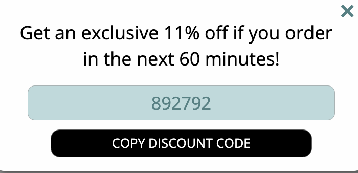
After having a call-to-action that's easy to find, having a great offer is the next thing to make a huge different in conversion rates. Think about it... if your offer was to give out $1,000 to the next 50 people that submitted the form, your conversion rate would go way up! But it doesn't have to be that extreme.
Lead Gen Offer
On the lead gen side of things, it doesn't have to be a cash offer, but think about what would help compel your prospective client to enter their information. Would it be a free consultation, a call with an expert, or perhaps even a free whitepaper to help them in their initial decision making?
We've even found there can be a dramatic difference between having just a regular "schedule consultation" vs. a "schedule a 15-minute call with an (insert industry name) expert". The latter is more inviting for a prospective customer and provides them the confirmation that someone is there to help them. Help visitors understand what actually is going to happen next if they give you their email and phone number.
Social Proof
Anyone can set up a website and claim they offer products and services. What differentiates established businesses is the fact they have credentials and (hopefully) have had happy customers.
Badges
Having social proof increases trust and boosts credibility. Social proof includes things like "badges" that confirm you are a legit business. This could be a BBB A+ rated business, a 5-Star rated business on Google My Business, a Chamber of Commerce member, a member of X Industry organizations, or even "as featured on..." If your client has been featured on TV, the news, or other major publications, these are all great things to feature on your PPC landing page. All those "social proof" badges and indicators let clients know that you are a legit, credible business and help instill trust.


Reviews
Another form of "social proof" are testimonials or reviews of your business online from either Google My Business, Facebook Reviews, Yelp or other areas where clients regularly review your work. People can have skepticism with reviews, so make sure you utilize several reviews and find reviews that are more detailed oriented and specific to the work you assisted with. This will go a long way to establishing trust in your brand, when your prospective clients read detailed oriented reviews.
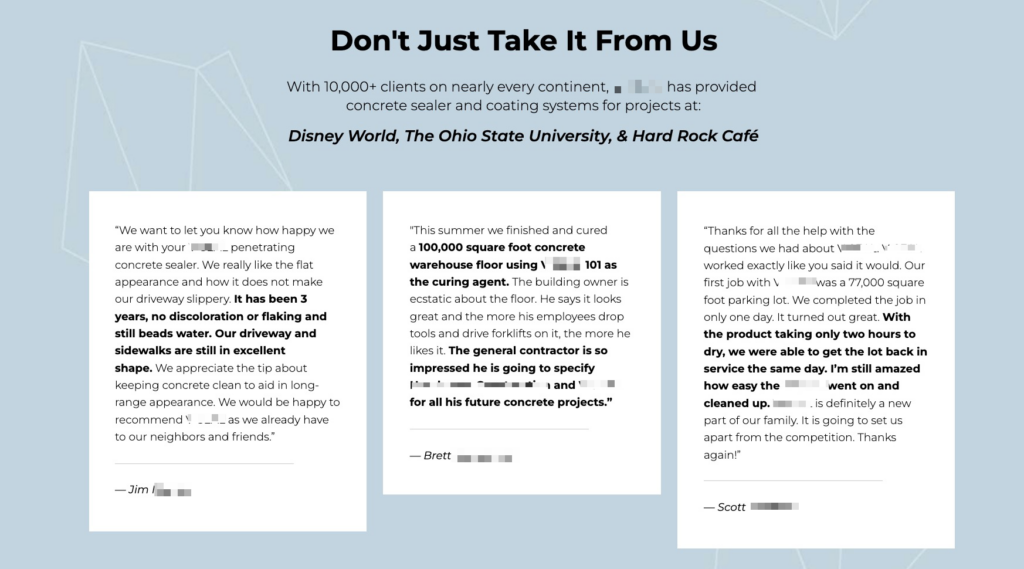
If you've had a lot of customers, don't be bashful. Let people know about it!
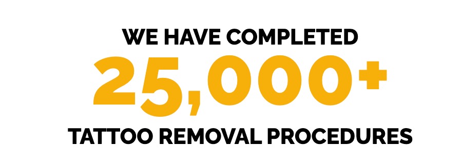
Call Out Your Core Benefits
There are at least 2-3 core reasons why you're a better option than competitors. Many landing pages fail because they give too many reasons, or go way too in-depth about why their special, their company background, etc.
If someone asked you to tell them in 10 seconds or less what makes your business stand out from the competition, make sure your landing page does that quickly and towards the top of the landing page. You want people to instantly understand why you are a better business than your competitors - because your prospective customers are likely checking out multiple businesses to see which ones resonate best with them.
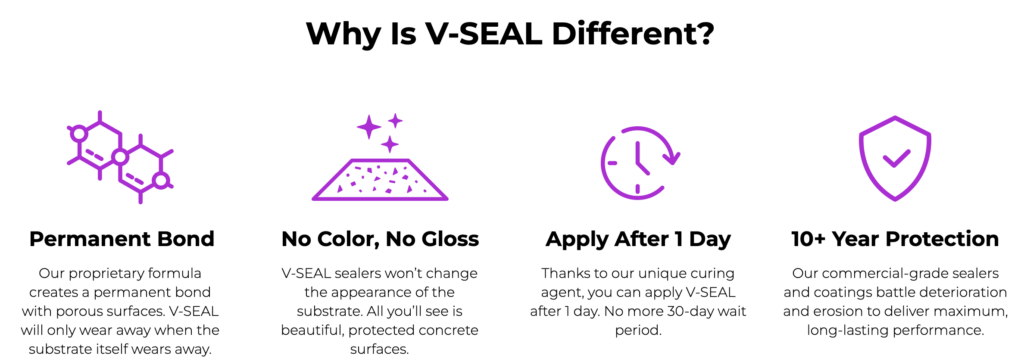
Most times, we'll help clients put those core benefits at the top of the landing page next to the contact form in the form of bullet points that are easy to read and quickly digestible.
Mobile Friendly
In today's digital landscape, having a mobile-friendly website is no longer a luxury—it's a necessity. With the majority of users accessing the internet via smartphones and tablets, it's crucial to optimize your landing pages for mobile devices to maximize conversion rates.
When visitors encounter a site that's not optimized for mobile, they're more likely to bounce due to difficulties navigating or viewing content. By ensuring your landing pages are responsive and easy to navigate on mobile devices, you can keep users engaged, increasing the likelihood they'll convert.
One mobile-specific strategy to consider is having a "sticky nav". That's where you have a top or bottom section that's locked into place as you scroll. This is a great place to have an offer or a phone number always there...
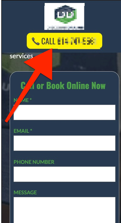
As someone is reading through the mobile site, as they scroll down the page, the header "sticks" to the top and allows them to read the rest of the page - but also allows them to call or contact you easily - no matter what section of the page they are on.
This is an extension of our #1 tip to have a clear call to action. If, for example, a phone number button is following you around everywhere you navigate to on the page, it should be pretty obvious that you're wanting them to call you.
Imagery & Video
People are visual creatures and "seeing" what and how you do things, can really help close the deal for a prospective customer. Using both images and videos can help to improve your PPC landing page conversion rates.
Use Real Photos
If possible, use real professional photos of your business instead of stock photos. People want to see real legitimate imagery of the company they may be investing in. It provides a more personal touch and helps people connect with the company behind the landing page.
Use images that show what a person receives after using your product or service. If you're a landscaping company, show the brilliant green yard the user will get after using your service. If you're a dentist, show the perfectly white teeth that a person will have after becoming a regular patient. If you're a law firm, show the relief that someone will feel after they've utilized your professional services.

Videos
Videos really help a person connect with your business, especially if the videos show your company in action or your product or services in action. Words and imagery can only provide so much context, a video really helps someone see how you work and why they should work with you.
In fact..."marketers who incorporate video into their campaigns experience 34% higher conversion rates (Aberdeen Group)." (source)
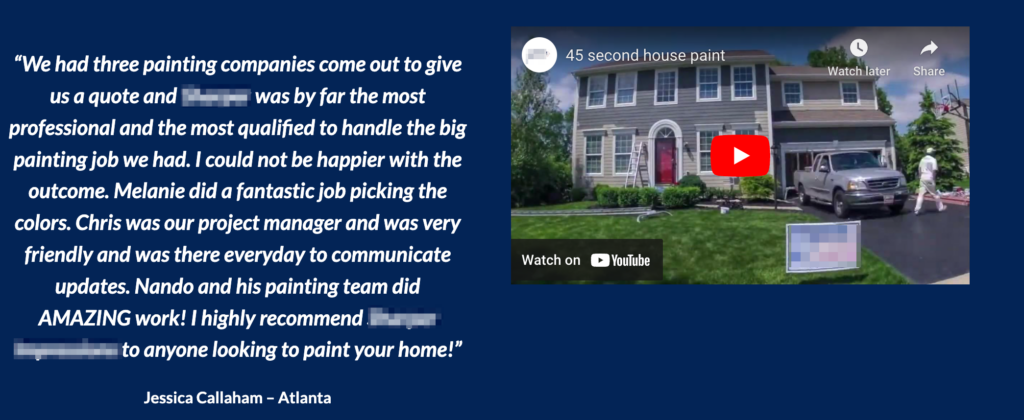
In the video below, this painting company has a 45 seconds long video that quickly shows the work they can do on an exterior house painting job. This really helps a user "see" what type of service and professionalism they will receive. Bonus tip - Add a testimonial like they do, near the video:
Exit Popup
Having a popup right as someone is about to leave the page is an almost guaranteed way of increasing conversions. An "exit popup" is a form that "pops up" as your about to leave the page or hit your back button. This works effectively because sometimes people just need another nudge or another reminder to contact you.
Add An Asset
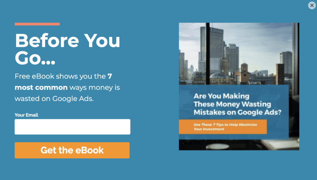
A best practice for exit pop-ups would be to provide the user something of value as they are leaving like an eBook, Whitepaper or other "asset". In the example below, the person trying to contact this PPC Agency may not be ready to contact them for a free quote, but a useful guide on saving money on Google Ads would be useful to them immediately, and provides this agency with the ability to follow up with that interested party later.
Use Pop-Up Triggers
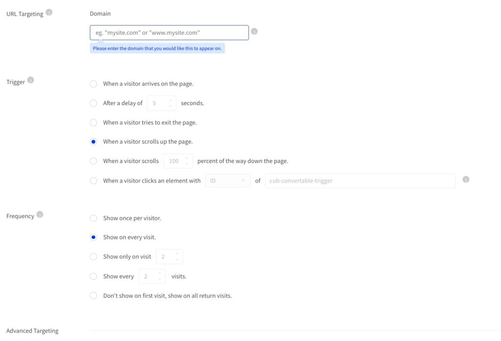
Many popup tools have lots of advanced features on when they'll show up, so you can reduce the "annoyance factor" to suit your preference. These are called "triggers" and provides you the ability to customize "when" a person will see the pop-up.
Minimize Form Fields
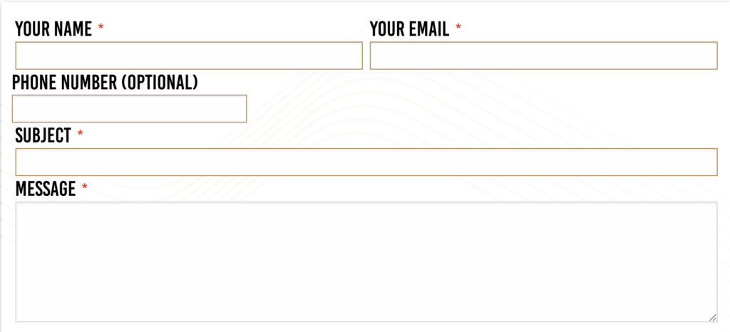
One of the most common PPC landing page mistakes we see are contact forms that are WAY too long, that require a person to enter more information than is absolutely required. We know that the sales teams out there are cringing, because they want a lead to come in already pre-qualified and ready to go, but if you are paying for traffic or working hard with your website to generate traffic - the HARDEST thing to accomplish is getting a new lead. The LAST thing you want to do is scare them away with a contact form that is way too long.
We know there are reasons where you may need to require a few more fields to weed out low quality leads, and that's totally fine. There's always a balance between too many fields and not enough. The point is to experiment and find the right amount based on your particular business.
Landing Page Contact Form Examples
In the below examples, if you were looking for a quote from a company, which form would you rather fill out? Note that these two forms are actually 2 different companies in the exact same industry.
This one?
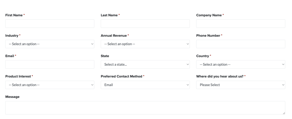
Or this one?
Conclusion on PPC Landing Pages
There are certainly additional tweaks and improvements you can make to your PPC landing page that aren't listed here, but we've gone over the most important ones that we've seen improve PPC conversion rates. There is not a one-sized fits all approach to landing pages, as it depends on your industry, your goals, and your individual business limitations.
Ideally, you would want to work with a PPC Agency that can help you to navigate both a successful PPC campaign and the associated landing page strategies to help meet your business goals.
The bottom line is, if you're going to pay to acquire targeted traffic to your website, ensure you have a strategy to capitalize and maximize the number of leads or sales you get from those campaigns. This in turn will help provide a positive return on your PPC investment.
Other PPC Landing Page Best Practice Resources
- HubSpot's Ultimate Guide to Landing Pages
- Unbounce's Landing Page Best Practices Guide - Unbounce is a paid landing page design tool and is utilized by many agencies and companies to develop PPC landing pages. They have a TON of data in terms of what they have seen work best for landing pages.
- Wordstream's 11 Landing Page Best Practices - They Swear By! - A leader in PPC Tools and Management, Wordstream always has great resources on all things PPC.
- Wordstream's 11 Best Landing Page Examples - We like this blog post because it provides actual examples of PPC landing pages, and the aspects of the pages that make them great. Practical and real world advice and application.
- KlientBoost's 31 Landing Page Best Practices Experts Never Ignore - KlientBoost is a leading PPC agency with hundreds (thousands?) of clients and case studies. This guide is probably the most comprehensive PPC Landing Page Best Practice guide out there with plenty of visuals.
- Why Your PPC Lead Gen Campaign Isn't Working - From the team here at Two Wheels Marketing - It's not just important to have a great landing page, you need a good intake and sales process to follow-up with those leads!
